New Packaging for Bitters & Cocktail Syrups Brand
- by Nemo N
-
Strongwater approached Twist & Tailor with the intent to redesign their packaging to launch their new rebrand.
Strongwater provided existing brand guidelines, logo and color systems.
The Problem:
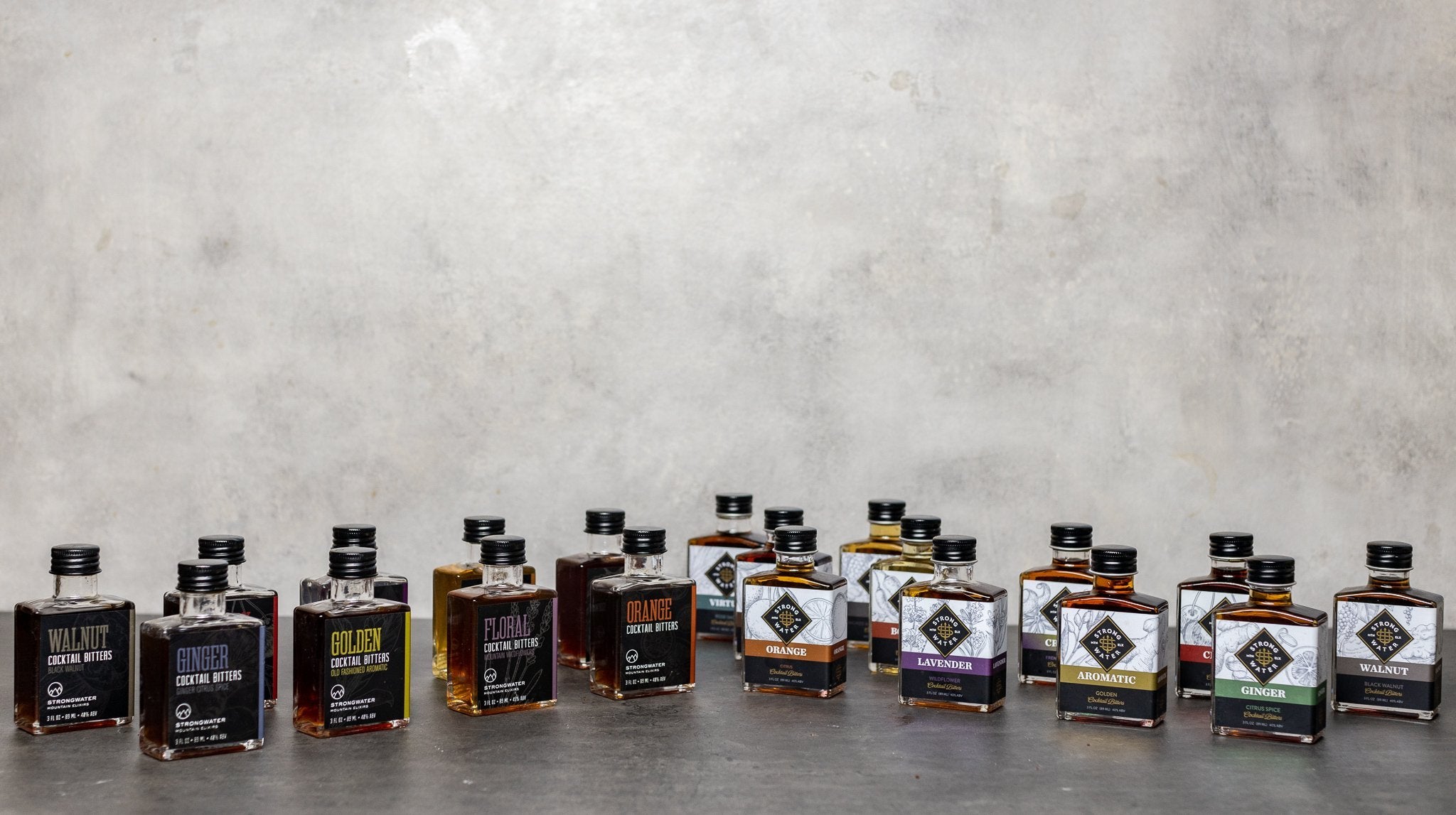
The goal was to translate the aesthetic established in Strongwater’s brand guidelines to all of Strongwater’s package design.
Moving the design to a more inclusive and softer aesthetic that they believed was their target demographic.
One of the main problems from the previous design was that it collectively did not stand out on the shelf.

Additionally, the dark package design did not photograph effectively due to a lack of contrast between type and design elements.
This became an issue with promotional/social media content.
Narrow, borderline illegible typography across multiple products. Establishing and launching the can and package design for the new Strongwater Sparkling line.
This was their introduction into this corner of beverage space. The can and package design needed to be dynamic and eye-catching while still upholding Strongwater’s new brand guidelines.
Redesigning Strongwater’s Bitters Box sets to communicate use of the product more effectively, one of their best selling products.
A lack of attention to ink and substrates used in printing led to very “flat” labels and packaging, as well as difficulty in differentiating products at first glance/in use.
Revamping label and package design ensures the brand functions effectively in an ecommerce space.
The Solution: Revitalized and Inclusive Graphic Design for Bottle and Can Labels

We assisted in implementing new branding with an inclusive design with cleaner concise typography, lighter illustrative elements, differentiation of product through color systems, and high contrast to ensure that the product stands out on the shelf and in an ecommerce space.
Attention to print materials used was important, using foils, metallic ink, and substrate to enhance design elements while staying on budget.
We introduced interactive physical package design elements in both bitters sets and Strongwater’s new sparkling line.
The updated design more effectively communicates instructions of how to use the product, which was previously a concern.
Utilization of QR code elements to package design linking ecommerce and recipe creation to each specific product also helps with the user's experience with the product.
Previously the design between products felt disjointed. The entire Strongwater collection is now united through design.
------
If you need assistance in rebranding or launching a new brand, we're happy to help. Please get in touch!


